Nordic Iron - clearer name, stronger identity
Nordic Iron is our new name. With an updated graphic profile, new tonality and a cleaner expression, we are taking further steps in our development. The change aims to make it easier to understand who we are, what we offer - and what we stand for.
It is about more than color and shape. It's about creating a modern and credible expression of a business that is based on openness, responsibility and a long-term approach. An expression that reflects both our product and our role in the transition to a greener iron and steel industry.
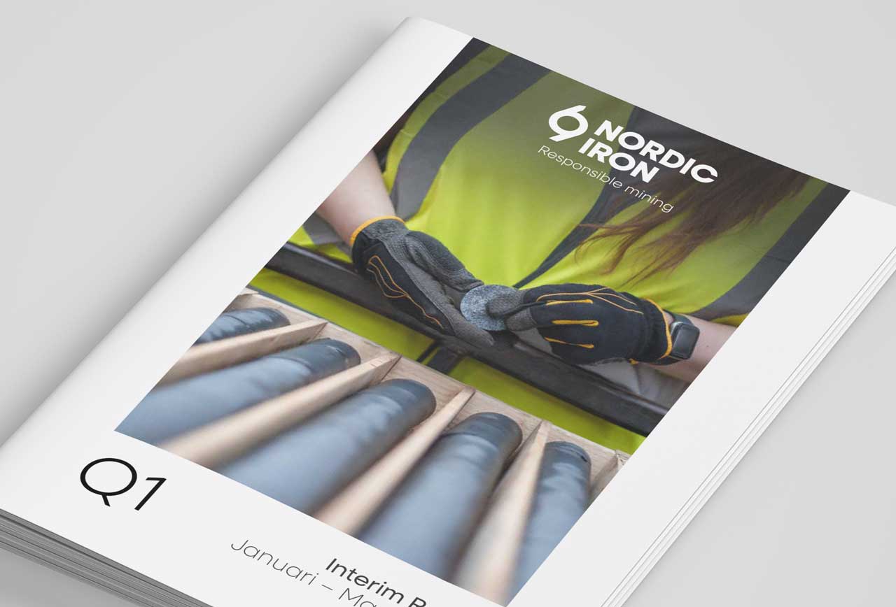
Behind the brand is still Nordic Iron Ore AB for the legal company. But in all communication we now use the shorter and clearer name Nordic Iron.


Why a new identity?
We want to stand for sustainability, localism, transparency, excellence and responsibility in all aspects of our business and as a foundation for our values.
With our new look, we want to communicate this more clearly, simply and consistently. The new identity helps us express what we stand for: being open, honest, accountable, competent and transparent.
A visual identity with a clear link to our core business
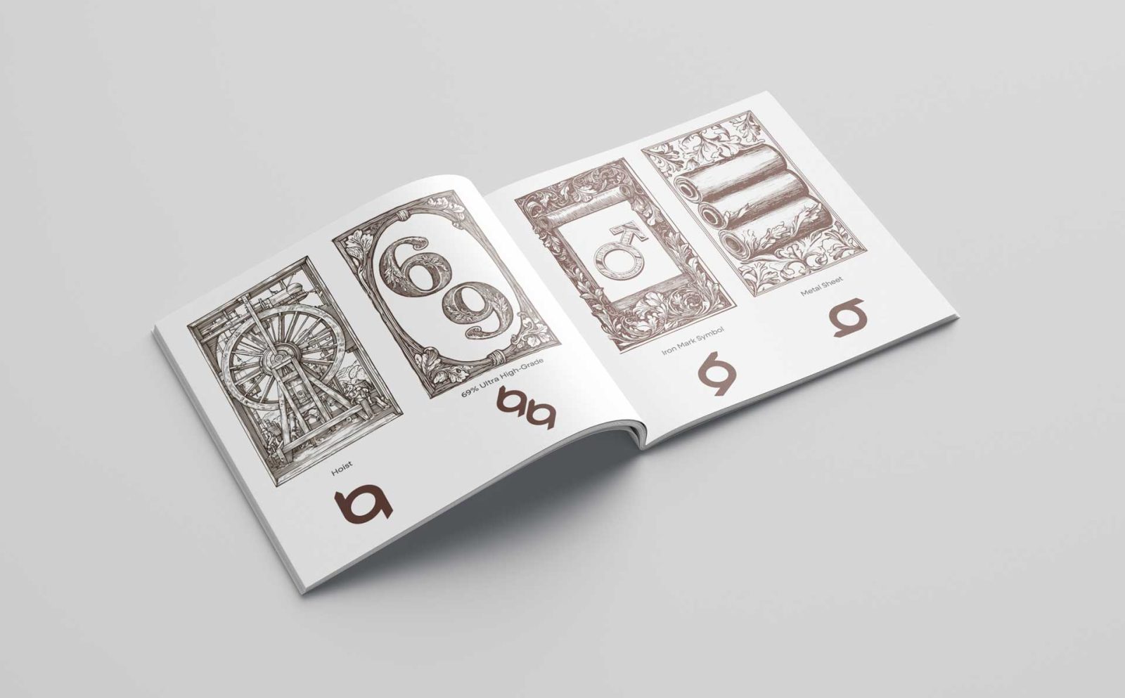
Our new logo is not just a graphic symbol - it is based on clear ideas and symbolism linked to what we do and what we want to achieve.
In particular, the proportions are inspired by the number 69 - our target iron content in the ultra-highly enriched iron ore concentrate. It's a quality that puts us among the top producers in the world.
In addition, the logo carries references to the elevator drum, as a visual reminder of the vertical structure of the mine, and to the chemical symbol of iron (Fe), reinforcing the industry link. The shape is also reminiscent of steel rolls and coils of sheet metal, representing the next step in the value chain, where our concentrate contributes to the products and solutions of the future.
The combination provides an identity that reflects both our technical precision and our future orientation.
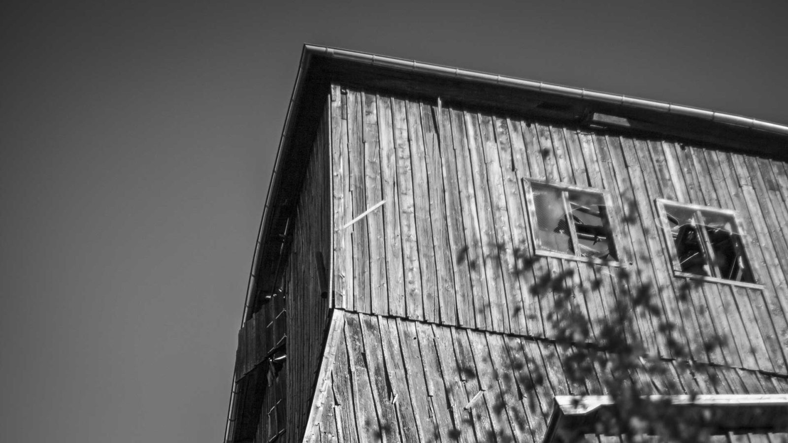
Color palette inspired by Blötberget
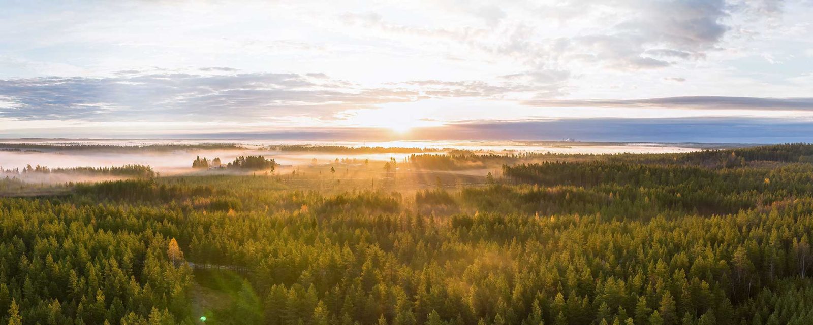
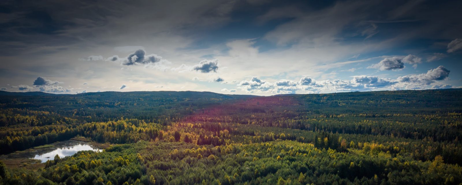
Our color scheme has been inspired directly by the nature around Blötberget in southern Dalarna. With color names such as Blueberry,Birch, Bark,Rowanberry and Autumn Leaves, we want to convey a visual identity that feels rooted in the place where we work.
The muted earth tones and greens reflect the forest and vegetation, while the soft blues are reminiscent of the sky and the fog that often sweeps across the landscape. The warmer reds and oranges capture the energy and life of nature - from berries and autumn leaves to the last rays of sunlight between the trees.
This palette strengthens our visual cohesion and builds an emotional connection to both the place and our vision of a sustainable future.
White Space
White space, or the empty space between design elements, is a guiding principle of our graphic identity. It creates calm, structure and gives our messages room to breathe. By consistently using white space in all our designs, we create a cohesive and professional visual experience
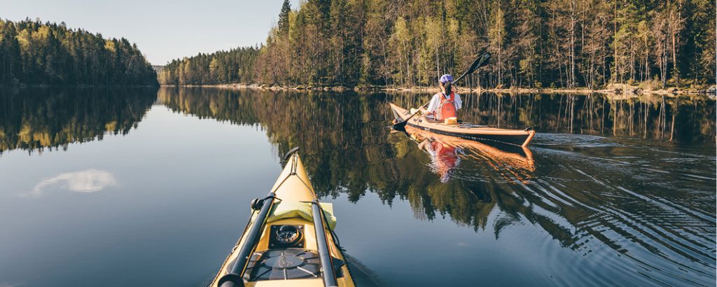
From mine to everyday life
Our imagery reflects the whole journey - from iron ore in the ground to products that affect our lives every day. By showing both the mining operations themselves and the end products, we want to convey that our work is about more than extracting a raw material. We are part of a global development, where our iron ore concentrate will be an important part of future iron and steel production and solutions for a more fossil-free society.
A company with deep roots and high ambitions
Our business is rooted in Bergslagen, a region with a strong mining history and great future potential. It has the experience, infrastructure and conditions to build something truly sustainable.
The Blötberget mine is our first step, but our plan is long-term. We see great potential in areas such as Väsmanfältet and Håksberg, while we plan to explore more opportunities in the region.Our imagery reflects the whole journey - from iron ore in the ground to products that affect our lives every day. By showing both the mining operations themselves and the end products, we want to convey that our work is about more than extracting a raw material. We are part of a global development, where our iron ore concentrate will be an important part of future iron and steel production and solutions for a more fossil-free society.
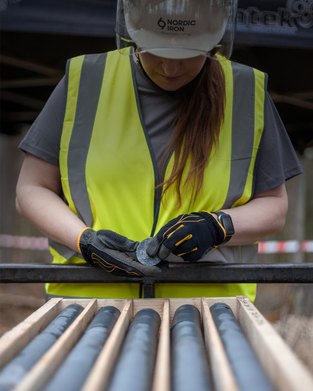
A product for the future
Iron is the basis of steel, and steel is the key to modern society and therefore also crucial for iron and steel to contribute to the green transition. But this requires that the iron raw material is of high iron content and purity, as well as efficiently and sustainably produced.
With an ultra-highly enriched iron ore concentrate of nearly 69%, Nordic Iron's product ranks among the world's highest grade products. We are also exploring the possibility of extracting by-products for the recovery of phosphorus and rare earth elements that are valuable resources for the society of the future.Our imagery reflects the whole journey - from iron ore in the ground to products that affect our lives every day. By showing both the mining operations themselves and the end products, we want to convey that our work is about more than extracting a raw material. We are part of a global development, where our iron ore concentrate will be an important part of future iron and steel production and solutions for a more fossil-free society.
From Nordic Iron Ore to Nordic Iron
Nordic Iron Ore AB remains our legal name. But we now communicate as Nordic Iron - a name that is simpler, stronger and more relevant to the values we build our business on.